Websites I might need to steel ideas from
This list is a work in progress. It might get updated any time.
Hey
Hey makes very liberal use of linear color gradients with a hue shift. The marketing page presents the product casually, using lots of colors, puns and scribbles. This might not be the perfect style any old business product but works very well for them.
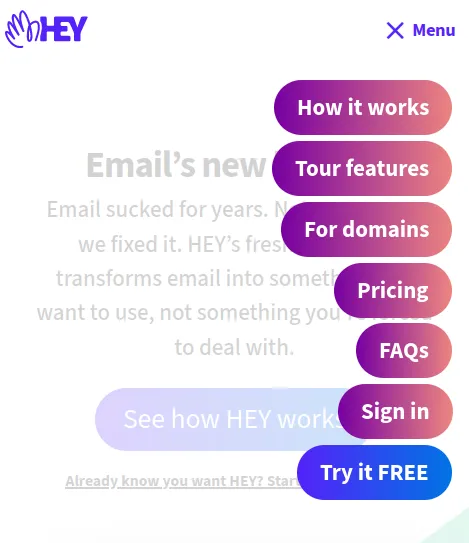
Let's take a look at some elements I liked especially. First is their very accessible sandwich menu on mobile:
The button features text which is very uncommon for sandwich menus. But let's not forget, not everybody has internalized the idea of a sandwich button. This gets around that limitation nicely.
There also is much to like about their product presentation. The first overview is a collection of product screenshots arranged over a colorful background. On mobile, only one screenshot is used, showing the mobile version of hey.
This idea I already stole for tisch.im.
Below they have a nice alternating screenshot-text layout with nice colorful backgrounds and text.
Lastly, their footer is pretty lightweight and works well on mobile and desktop.
The market lingo is a bit too much for my taste, but the design is top notch.
Stripe
While stripe has a standard SaaS-website layout, they incorporate a lot of bolder design elements. They work well together and create a beautiful brand esthetic.
One bold design choice: Letting a colorful animation overlap the websites headline.
Stripe also has a great attention to details. E.g. the CTA buttons have this subtle animation effect on hover that transforms a chevron into an arrow.
Another example is the menu line in the websites header. When hovering over a menu item a popup displays categories and subcategories. Moving between menu items or subcategories does not open new popups but seamlessly transforms the already open popup into the new menu.
The website features lot's of small animations. In my opinion the website over all is a bit too heavy and can be laggy on less powerful devices. Also, there are too many non-interactive animations that can steal the visitors attention. So, a lot of good, a bit room for improvement, too.
Magic Bell
Magic bell makes masterful use of a simple, yet effective color scheme. Above the fold (view of the site with out scrolling down), the site is very clean. It uses variations of three colors only. I love their typography for headlines. They use "ITCSouvenir" which works really well.
Below the fold I am less impressed, but the first impression is done really well. Funny enough, there are no elements that I'd like to steal explicitly. It's more of the overall aesthetic.
11ty
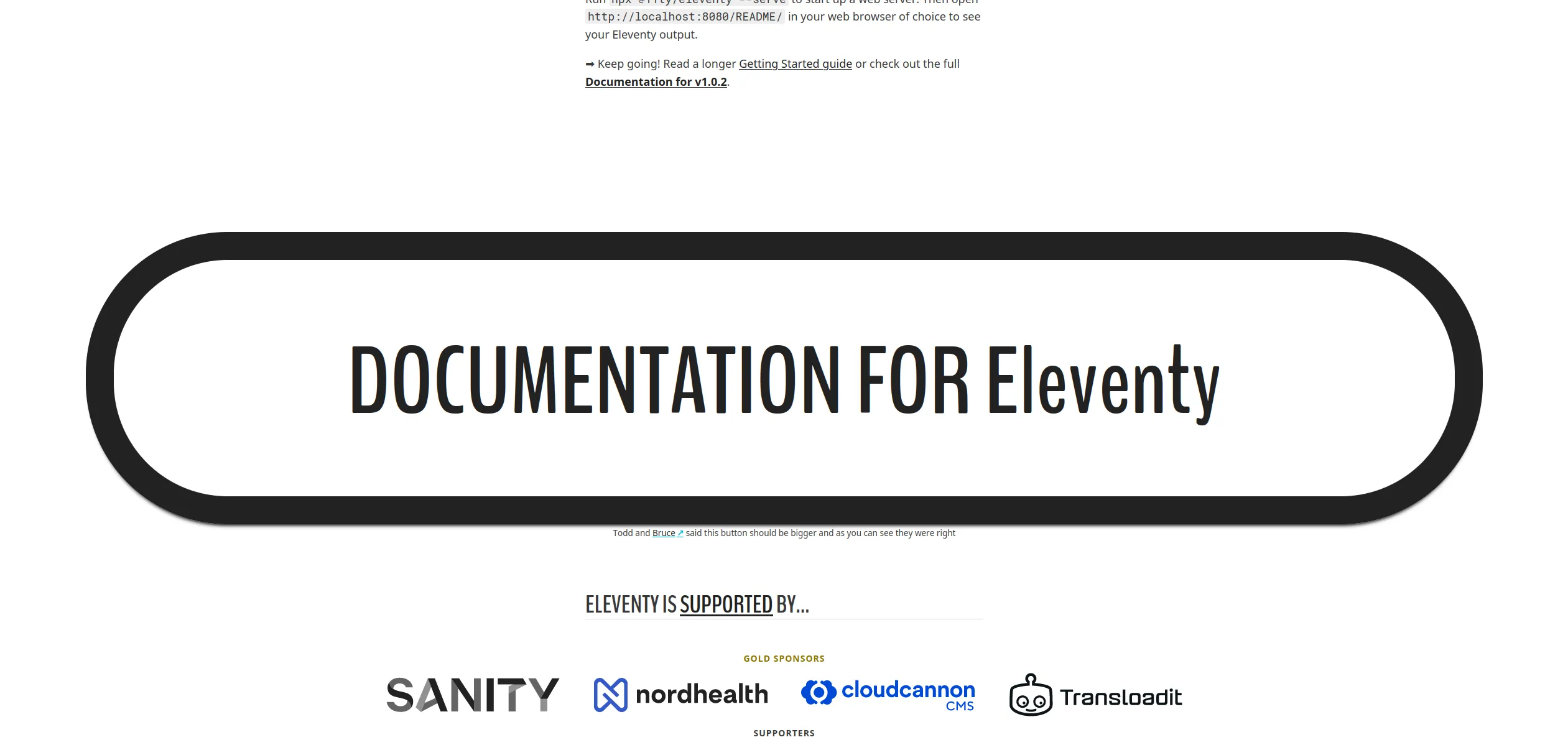
I like especially one thing about the 11ty website, the ginormous "Documentation" button.
It is nearly full width and has a very strong hover effect.
When I first came accross that button, I wasn't sure if it is a bug or not. Below the button there is a tiny explanation, though: "Todd and Bruce said this button should be bigger and as you can see they were right". The button is attention grabbing and brings you exactly where you most likely want to go. Who doesn't hate tool-websites where you have to search for the documentation link?


